Brand book
Everything hangs on one thread.
The Vincu identity in one place — logo files, color, type and ready-made social assets. Download what you need; the rules fit on a page.
Download the full kit
SVG · PNG · JPG — one zip, 2.3 MB
Vincu — from the Latin vinculum: a bond, a tie, the link between two parties.
01
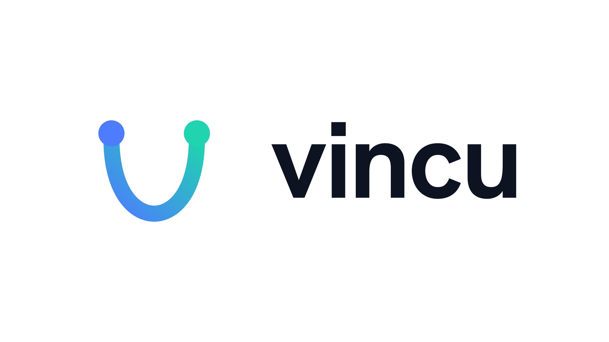
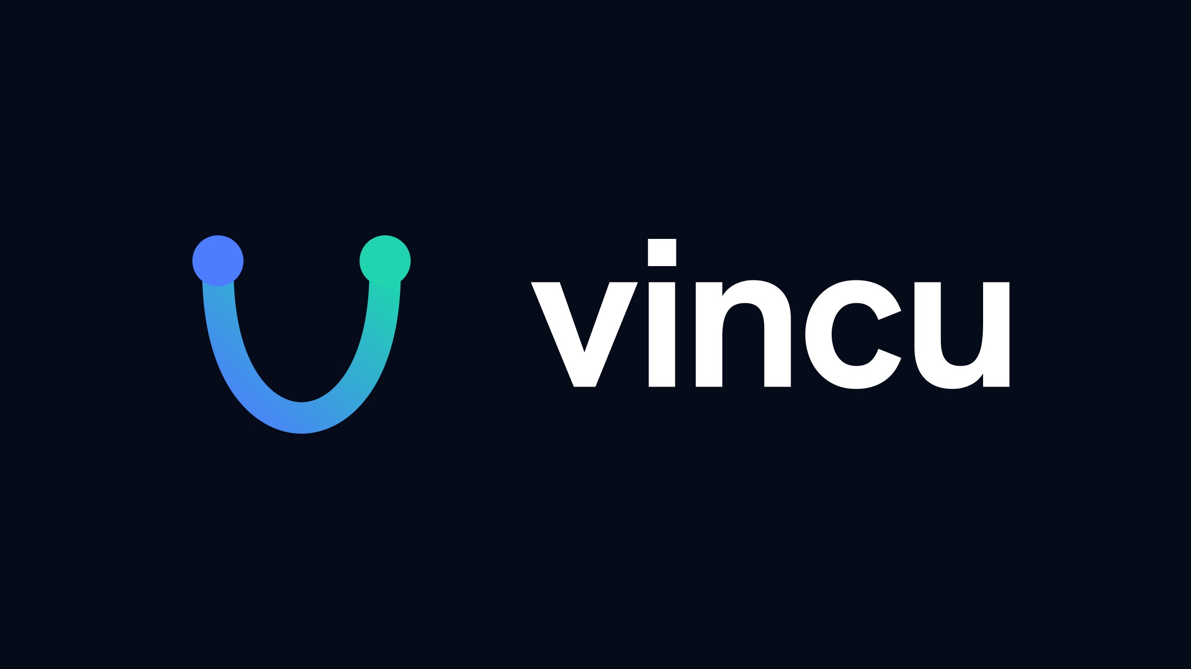
The mark
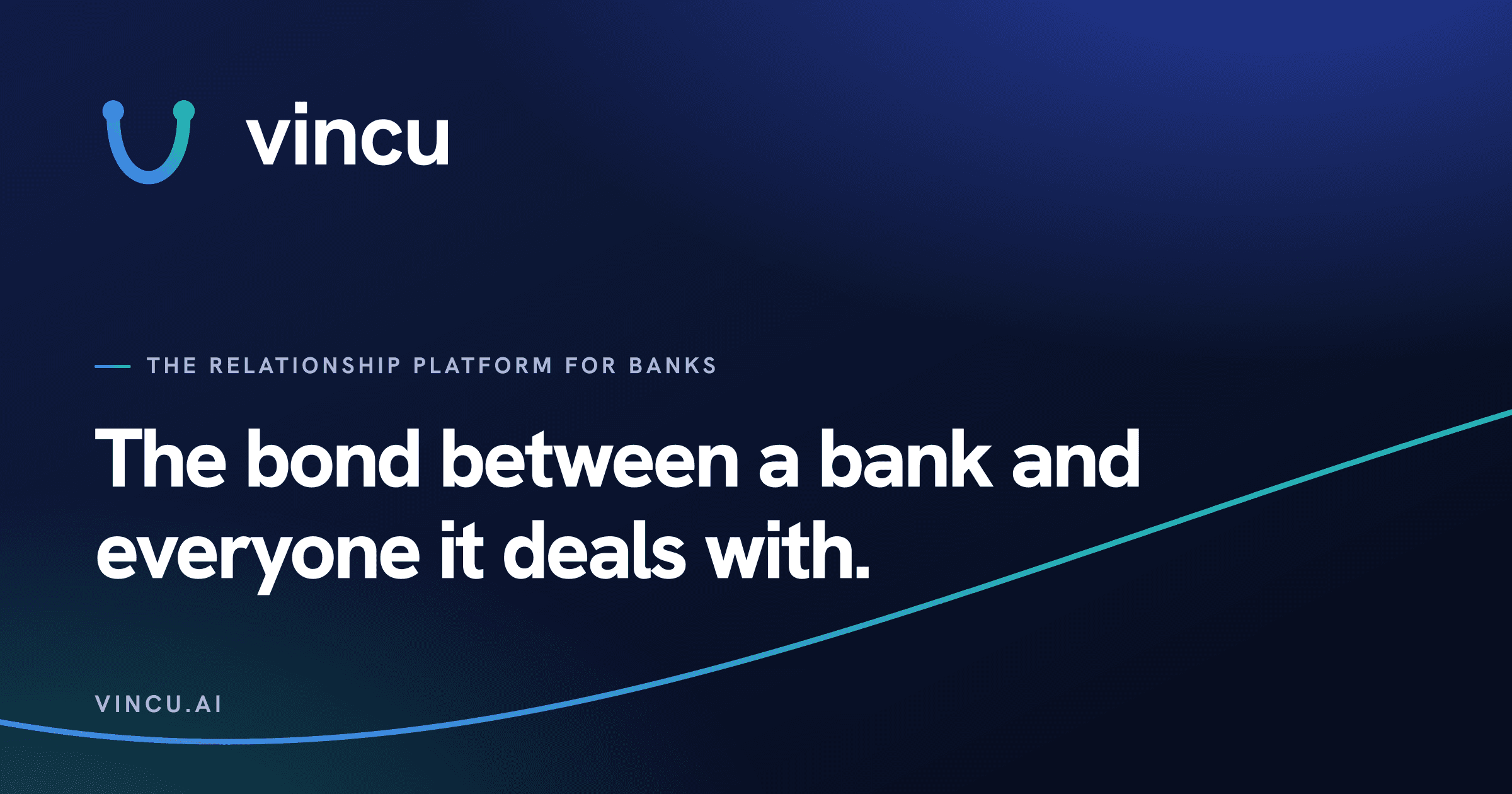
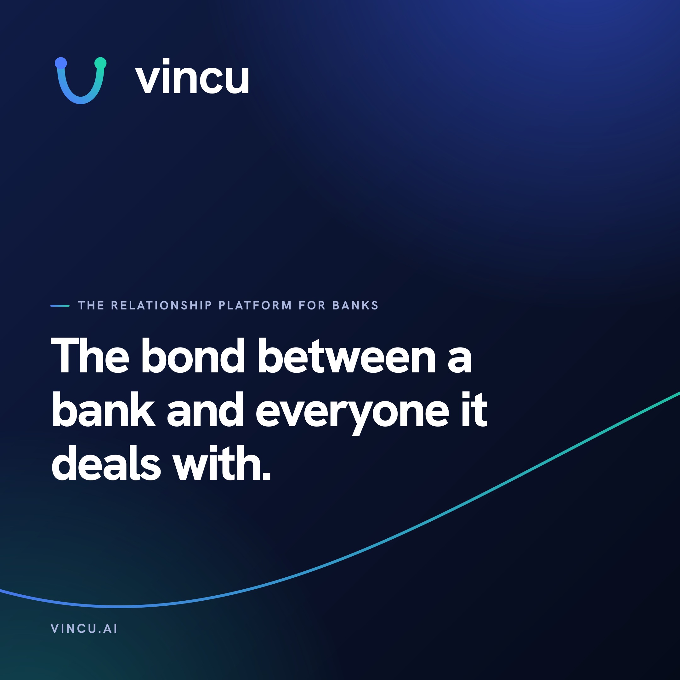
Two nodes — the bank on one side, everyone it deals with on the other — joined by a single drawn thread. That thread is the vinculum the name comes from: a bond, a tie, the link between two parties.
Use the full lockup wherever there is room. Anywhere square or small — avatars, favicons, app tiles — the mark stands alone.
Clear space
Keep at least one node-height of empty space around the logo on every side.
Minimum size
Lockup: 24 px tall on screen, 8 mm in print. Smaller than that, switch to the mark.
02
Color
Deep ink, cool paper, one decisive cobalt — and the thread gradient reserved for the bond itself. Click any swatch to copy its hex value.
The thread gradient
Always blue into teal — never reversed. It runs left to right, or lower-left to upper-right.
#4d7cfe → #1fd4af
03
Typography
Three faces, three jobs. All free on Google Fonts — nothing to license, nothing to install for the web.
Display
Hanken Grotesk
Headlines and the wordmark. Bold to extra-bold, tight tracking, large sizes.
500 · 600 · 700 · 800
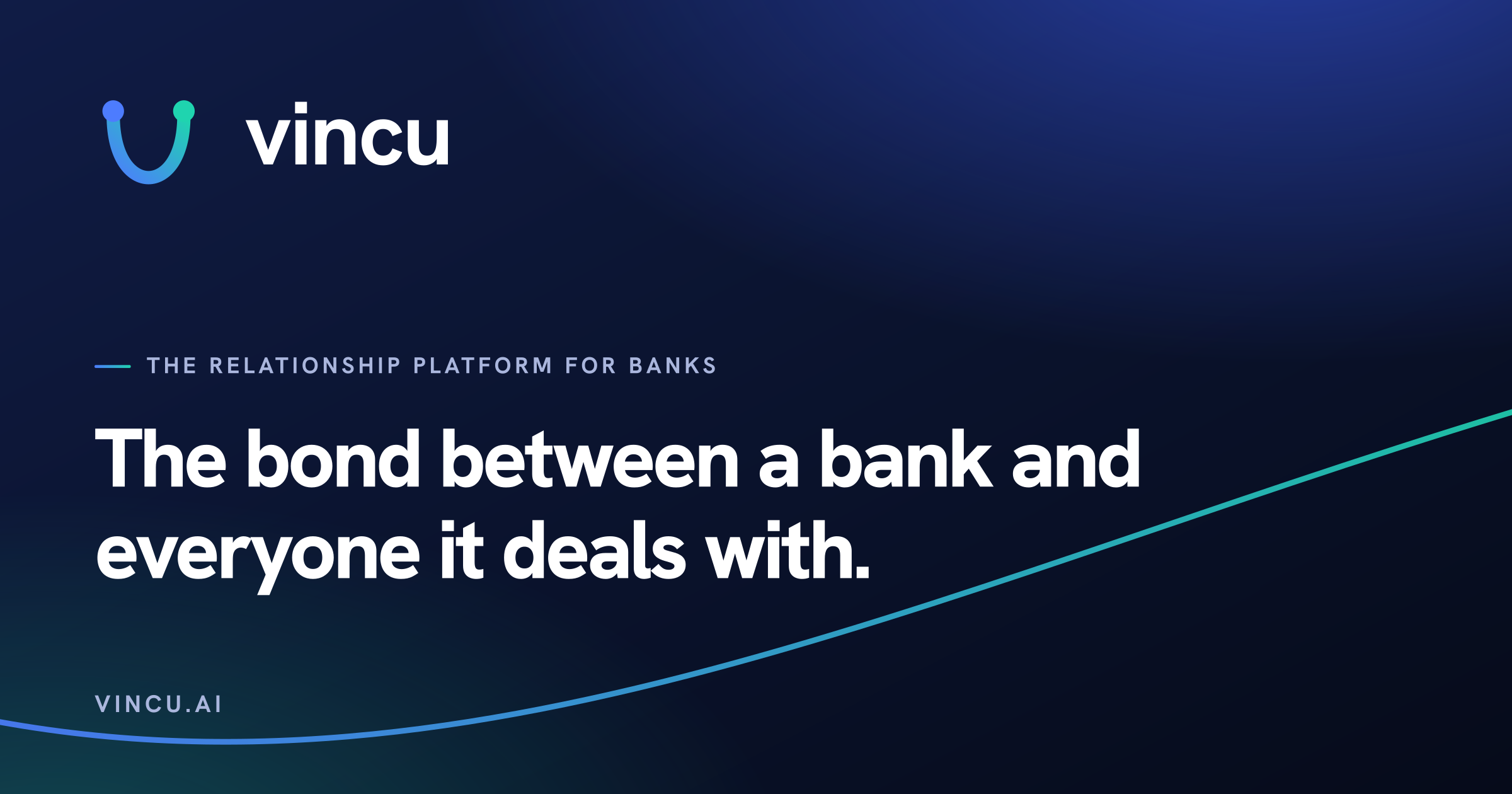
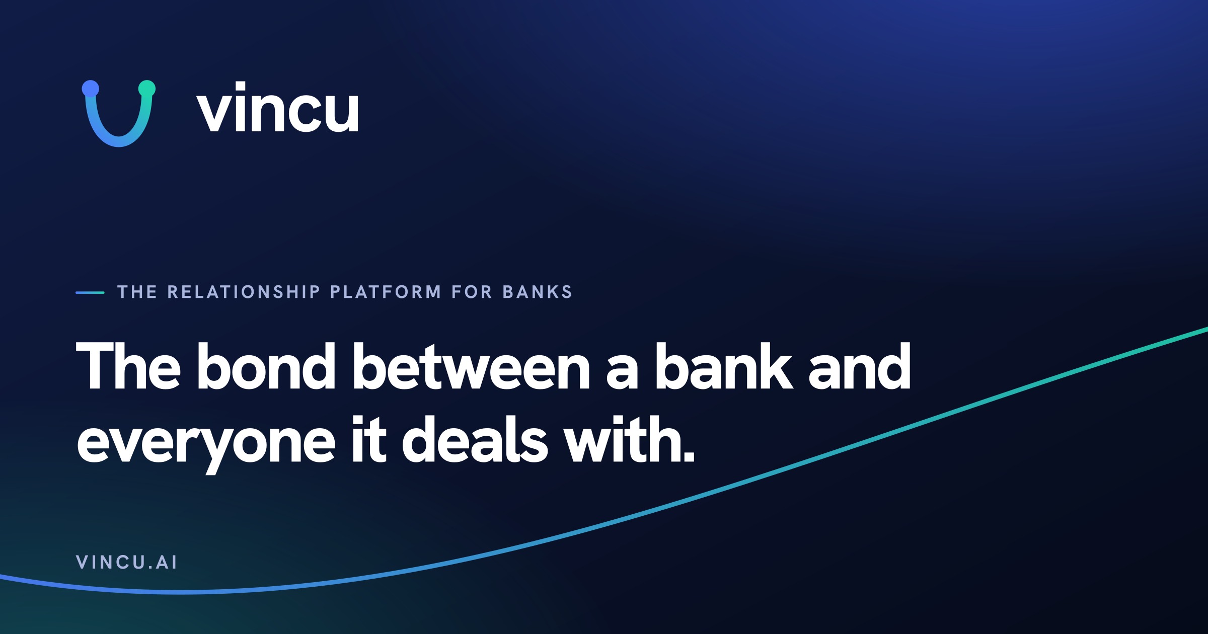
Google Fonts ↗The bond between
Text
Instrument Sans
Body copy and interface text. Regular to semi-bold at reading sizes.
400 · 500 · 600 · 700
Google Fonts ↗One place where customers apply, upload, sign and ask — and where departments decide, route and respond together.
Labels
Spline Sans Mono
Eyebrows, numbers and small labels. Uppercase, wide tracking.
400 · 500
Google Fonts ↗THE RELATIONSHIP PLATFORM FOR BANKS
04
The thread
The signature element. One continuous line that joins two points — drawn, never static, wherever motion is possible.
- 01
One thread per composition. It marks the bond; two threads mean nothing.
- 02
The gradient runs blue → teal. Never reversed, never recolored.
- 03
It connects things — start and end it at meaningful points, not decoration.
- 04
In motion it draws itself in once; it doesn't loop or bounce.
05
Social kit
Ready-to-post files for profiles, headers and announcements — exported at 2× for every platform's recommended size.


06
The rules
Short list. If a use case isn't covered here, ask before improvising.
- Use the provided files — they carry the exact geometry and gradient.
- Put the logo on ink, paper, white or photography with enough contrast.
- Use the mono versions when color isn't available.
- Keep one node-height of clear space on every side.
- Don't recolor, outline, shadow or add effects to the logo.
- Don't stretch, rotate or rebuild the wordmark in another font.
- Don't reverse the thread gradient or set it teal → blue.
- Don't borrow partner brand colors — Vincu stays cobalt, even next to a client's red.
Need something that isn't here?
Press materials, co-branded assets, anything unusual — ask us before improvising.